"HMap" Button

When the HMap button is enabled under the chart window, an additional Order Heatmap window opens, displaying colored markers from trades. Depending on the selected settings in the HMap button menu, as well as the type of exchange — centralized or decentralized — the functionality of the “Order Heatmap” differs.
Order Heatmap for centralized exchanges: Binance, HTX, Bybit, Gate, Bitget
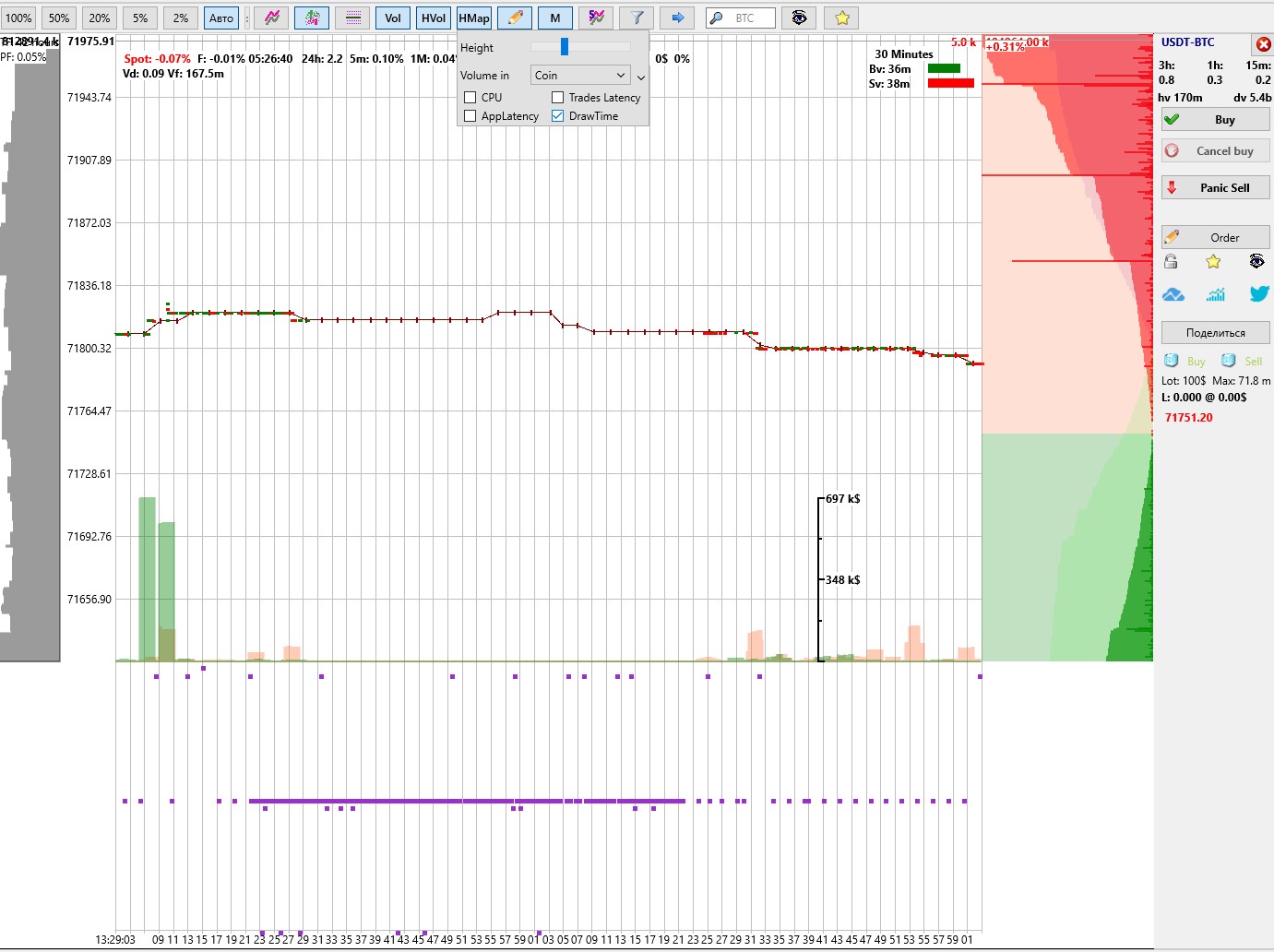
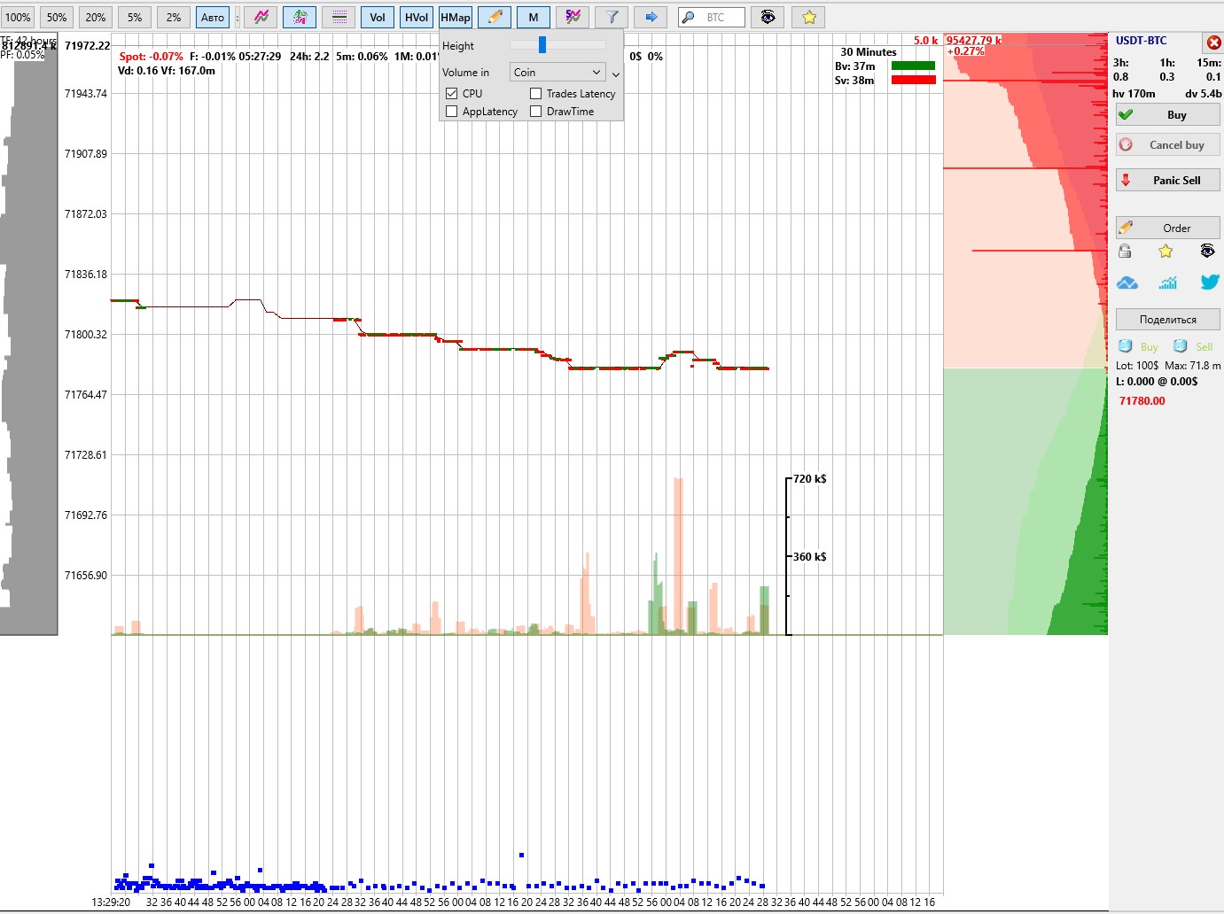
In the Moonbot terminal connected to centralized exchanges Binance, HTX, Bybit, Gate, Bitget, the HMap button allows you to enable the order heatmap, where colored markers are displayed: green for buyers and red for sellers, along with their volumes.
Before a potential price increase (pump) or decrease (dump) on a coin, sequences of trades with identical volumes are often observed. This may indicate the activity of a trading algorithm or actions of a large market participant attempting to influence the price.
The heatmap allows you to visualize each order individually and build an overall picture of order distribution by volume. This helps identify patterns in sequences of identical orders.
⚠️ Attention! For the heatmap to work correctly, you must disable Moon Streamer and open the settings via Menu → System Settings, then make sure that the VDS Mode (optimization) checkbox is unchecked. If this mode is enabled, order markers will not be loaded into the heatmap.
On the spot market, trade data is received separately for each trading pair. For futures, the heatmap is built based on spot data of the USDT pair for the corresponding coin.
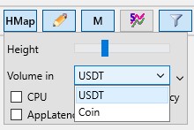
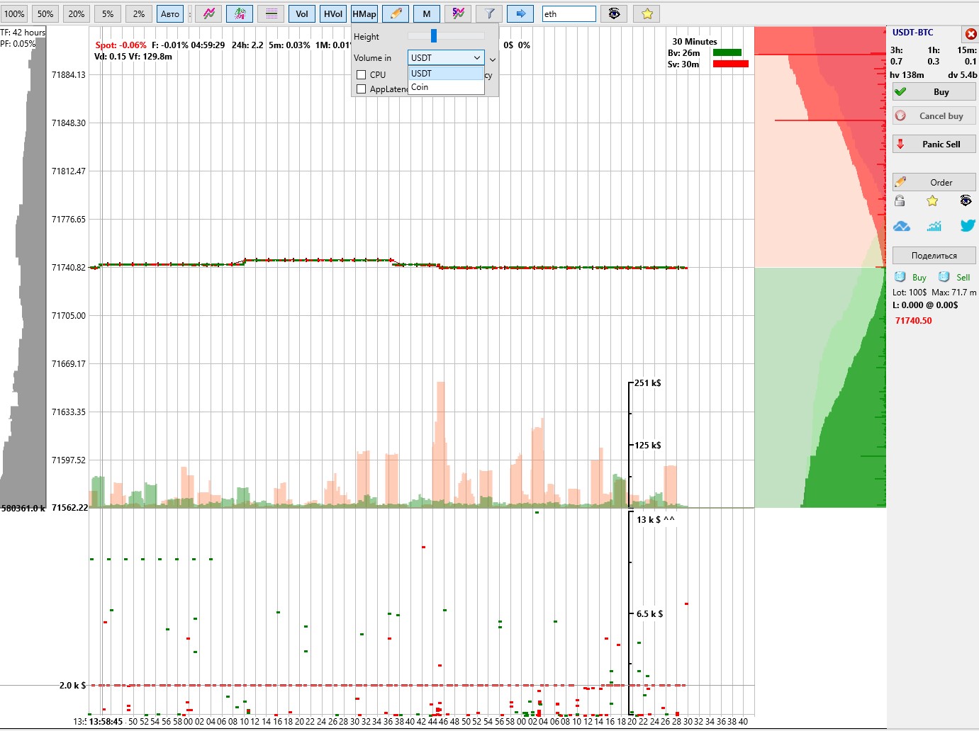
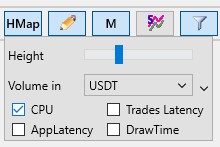
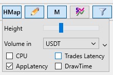
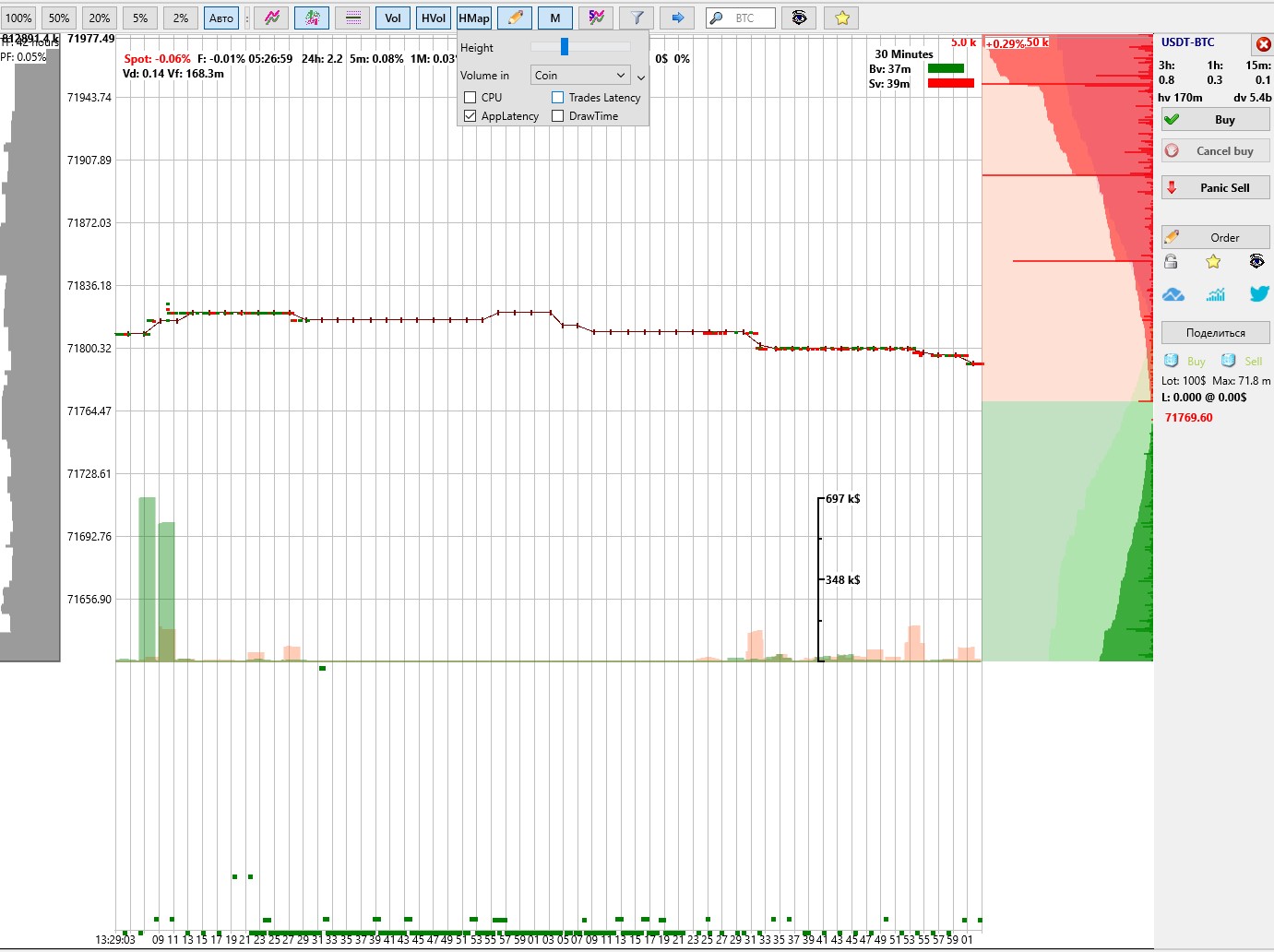
When you click the HMap button, a window will open with the following parameters available:
-
Height — a slider to adjust the height of the order heatmap window;
-
Volume in — selection of order volume units: in USDT or in coins (Coin).
When working with the chart:
-
If you hover the cursor over the coin chart, you can use the mouse wheel to zoom the chart and accordingly change the spacing between markers on the heatmap;
-
If you hover the cursor over the heatmap window, you can use the mouse wheel to adjust the vertical scaling of markers by volume;
On the right side of the heatmap window, a fixed volume scale is displayed. The exact volume value can be seen on the left — on the cursor when moving it vertically across the heatmap window.
For example, in the screenshot above, a series of frequent sell orders (red markers) with the same volume of 2k$ is clearly visible, which may indicate that a large position is being sold in parts using equal-sized orders. In this case, in the absence of strong buying or buyer resistance, sellers may push through the support level with such actions, which can lead to a price drop. In addition, you can monitor the density of green and red markers, which shows how multiple traders join trading simultaneously, collectively influencing the price.
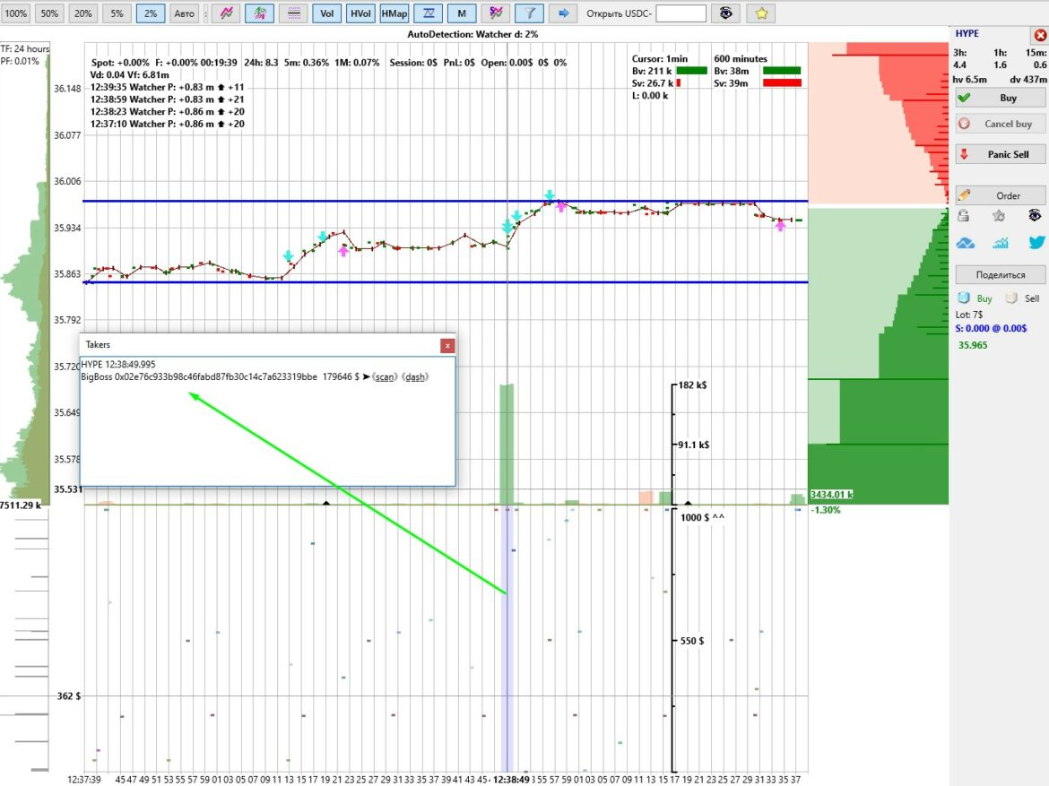
Order and address heatmap for the Hyperliquid decentralized exchange
In the Moonbot terminal connected to the decentralized exchange Hyperliquid, the HMap button allows you to activate the order and address heatmap. It enables tracking the actions of other traders with display of the coin, time, order volume, and trading addresses.
In the HMap button settings:

-
Height — a slider to adjust the height of the address heatmap;
-
Volume in — selection of volume units (USDT or Coin); for DEX this setting is not used and can be left, for example, as USDT;
When working with the interface:
-
If you hover the cursor over the coin chart, you can use the mouse wheel to zoom the chart and change the spacing between markers;
-
If you hover the cursor over the heatmap window, you can use the mouse wheel to adjust the vertical scaling of markers by volume;
On the right side of the order heatmap, a fixed volume scale is displayed. The exact volume value can be seen on the left on the cursor when moving it vertically.
Order markers in this heatmap are highlighted with different colors corresponding to different market participants, allowing you to visually track their trading activity.
Viewing address information
To get detailed information about a trading address:
-
Hover the cursor over the heatmap area;
-
Hold the Shift key;
-
Click the left mouse button in the desired area.
After that, the Takers window will open with information in the following format:
HYPE 12:38:49.995
BigBoss 0x02e76c933b98c46fabd87fb30c14c7a623319bbe 179646 $ ➤《s̲c̲a̲n̲》 《d̲a̲s̲h̲》
Explanation:
-
HYPE — coin;
-
12:38:49.995 — timestamp (based on the vertical cursor line);
-
BigBoss — address alias;
-
0x02e76c933b98c46fabd87fb30c14c7a623319bbe — trader address
-
179646 $ — order size;
-
➤《scan》《dash》 — links to analytics services:
🔗https://hypurrscan.io/ и 🔗https://hyperdash.info/;
In the Takers window, you can adjust the font size using Ctrl +/-.
The address “capture” area can be highlighted in blue when the Measure Tool option is enabled in the Vol button menu. The width of this area is fixed, however, when changing the chart scale, the number of addresses included in it changes: when zooming in — fewer addresses with higher precision, when zooming out — more addresses for general analysis and quick identification of which group of addresses was more active or had significant order sizes, so they can be tracked later.
In the Takers window, you can assign an alias to an address (for example, BigBoss). After closing the window, the information is saved to the file data\HLAddrBook.txt in the following format:
0x02e76c933b98c46fabd87fb30c14c7a623319bbe=BigBoss.
Using aliases allows you to navigate faster and track addresses of interest.
In addition, in the Takers window you can select and copy a trading address either by using the Ctrl+C shortcut (copy to clipboard) or by right-clicking and selecting Copy, in order to further check its trading data in third-party services. This address can also be used in the Watcher strategy, which generates detections and displays the activity of this address using various arrows on the chart and additional data in the detection lines in the upper-left corner of the chart. More details about the Watcher strategy >>>
CPU parameter
In the HMap button menu, you can enable the CPU parameter checkbox. After that, instead of orders, a diagnostic CPU load chart will be displayed in the order heatmap window as blue dots.
When moving the cursor vertically across this chart, the label C: with CPU load percentages (from C:0 to C:100) will be displayed on the left along the cursor line.
After monitoring this data, you can disable the CPU parameter checkbox, and the order heatmap will be displayed again in this window.
Trades Latency parameter

If you enable the Trades Latency parameter checkbox in the HMap button menu, then instead of orders, a diagnostic Trades Latency chart will be displayed in the heatmap window as orange dots, showing trade delays.
When moving the cursor vertically across this chart, the label L: with latency data in milliseconds (from L:0 and higher) will be displayed on the left along the cursor line.
After monitoring this data, you can disable the Trades Latency parameter checkbox, and the order heatmap will be displayed again in this window.
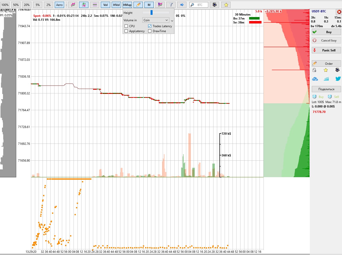
Lags on the Binance and Bybit exchanges can also be viewed on our special resource "Trade Lag Monitor": https://latency.moonbot.pro/
-
"Trade Lag Monitor" is now open source https://github.com/Moonbot-Tech/TradesLag and this removes the questions "what about the other terminal?" and it allows you to use data on lags in tickets and questions in Telegram groups to support exchanges ("here is an example code").
-
In the "Trade Lag Monitor", you can check your "bad" trades by time (on the UTC page) due to lags, if any.
-
Not all pairs are in the "Trade Lag Monitor", as there is still an open hypothesis that there may be different lag on different pairs. So far, we have separated TradFi from "heavy" coins in color, as well as the Bybit exchange for visual comparison.
AppLatency parameter
You can also enable the AppLatency parameter checkbox in the HMap button menu. In this case, instead of orders, a diagnostic AppLatency chart will be displayed in the heatmap window as green dots, which conditionally shows how much the application itself is lagging. The thread synchronization time is ideally up to 16 milliseconds (VDS timer precision), and under normal conditions — up to 100 milliseconds.
When moving the cursor vertically across this chart, the label A: with latency data in milliseconds (from A:0 and higher) will be displayed on the left along the cursor line.
After monitoring this data, you can disable the AppLatency parameter checkbox, and the order heatmap will be displayed again in this window.
DrawTime parameter
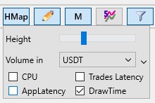
If you enable the DrawTime parameter checkbox in the HMap button menu, then instead of orders, a diagnostic DrawTime chart will be displayed in the heatmap window as purple dots, showing the chart rendering time with trades.
When moving the cursor vertically across this chart, the label D: with latency data in milliseconds (from D:0 and higher) will be displayed on the left along the cursor line.
After monitoring this data, you can disable the DrawTime parameter checkbox, and the order heatmap will be displayed again in this window.